What Happened to Facebook’s 20% Text Grid Tool? (Updated 2020)
October 1st, 2020 by
Editor’s Note: This post was originally published on March 25th, 2016, and has been updated to provide you with the latest information.
Update (October 1, 2020):
Back in 2016, we were all so very excited to see the Facebook Grid Tool disappear. Unfortunately, it was replaced with similar restrictions of labeling ads with High, Medium, Low, or Ok amounts of text, and we found that ads were still being penalized for including large amounts of text. So is it true this time? Is it really gone?
Facebook Grid Tool OFFICIALLY Removed
See for yourself! The original Facebook Grid Tool (https://www.facebook.com/ads/tools/text_overlay) now redirects to the Business Help Center page on Best Practices For Image Ads on Facebook. These new guidelines strongly advise that testing is the best way to find out what works best for your audience, and we agree! Of course, Facebook still recommends that you should avoid excessive image text. Their new guidelines state “We’ve found that images with less than 20% text perform better,” so it’s clear that they still stand behind their 20% even if they are not enforcing it. As a designer, I agree that there is something to be said for that. Too much text, especially on smaller ads, can negatively impact readability. But what’s so great about the update is that you can now A/B test different types of creative and find what best meets your campaign goals without being limited by Facebook.
Backend Warnings Removed
On top of the removal of the actual grid tool itself, we also found that ads with large amounts of text, like this example below, are no longer being flagged by Facebook and campaign reach has not been affected.
What Does This Mean For You?
As advertisers, we are thrilled to be more in control over testing creative and optimizing our campaigns. We live for it! For business owners running their own campaigns, this might be somewhat of a scary change. Optimizing campaigns for peak performance can take time and effort, which may be challenging to manage on top of other things. Let us help you! Schedule some time to meet with one of our strategists and discuss your goals as well as any questions you have.
Wondering about the history of the 20% text grid tool? We’ve been monitoring this for years. Here’s our update from June 13, 2016:
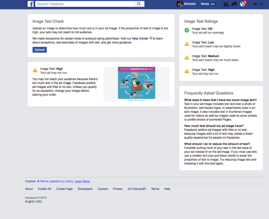
It looks as though Facebook has officially rolled out this update to the 20% text rule! Here is the link to the new help page. When uploading your images to the new “Image Text Check” tool, you’ll automatically be notified of the likelihood of your ad reaching its intended audience (see our new screenshot below). If you’d like to better understand why your ad receiving less delivery, you can check the Ads Manager “Delivery” column.

Original Post (March 25th, 2016):
Facebook seems to slowly be rolling up an update to their 20% text rule for Facebook Ads and Promoted Posts, which means some people are no longer able to access the Facebook Grid Tool. Our very own Kaitlyn Levy made this discovery when she was redirected to a Facebook Help Center page after trying to use the grid tool. But this new help page only seems to be accessible to a few, select users.
So What’s Changed?
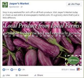
There are four categories for the amount of text allowed on a Facebook ad. Your image text can be considered “OK”, “Low”, “Medium”, or “High.” The amount of text on your ad will determine the reach that it could potentially have. For example, an image that has the following text would be considered “Medium,” which may cause your ad to reach fewer people.

What Does This Mean for You?
While the strict 20% text rule seems to be falling by the wayside, the overall amount of text allowed on your ad can still have a huge impact on your ad’s reach. Your ad may not be rejected, but Facebook says that an ad with “High” amounts of image text may not reach your audience.
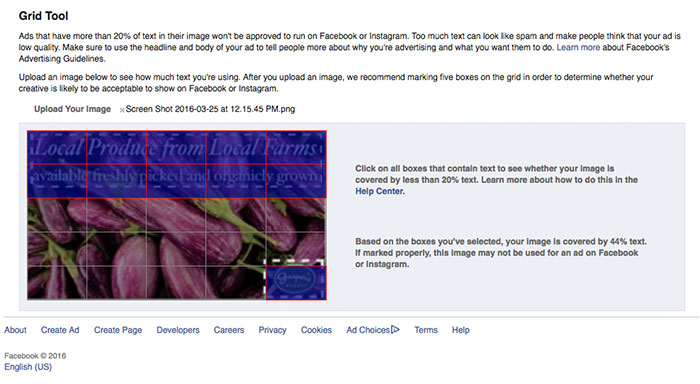
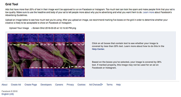
Additionally, without a strict grid in place, you may have a bit more flexibility with the layout of your ad, but you still need to keep in mind the overall amount of copy in your message. When loading the examples provided on the help center page into the Facebook Grid Tool, you will see that the example in the “Low” category has 44% text, but the example in the “Medium” category has 36% text. The difference between the two examples is that the “Low” category, even with a larger font that takes up slightly more space on the ad, still has more copy than the “Medium” category example.
The “Low” Category Example in the Grid Tool:

The “Medium” Category Example in the Grid Tool:

Are There Any Perks to the New Guidelines?
Yes! Along with the rollout of the new guidelines, they have also included some “exceptions” to the rule. There are some types of text that won’t limit your ad’s reach. Some of these exceptions include, movie posters, book covers, product images (only where the entire product is seen), legal text, and infographics. Some of the items that will still be counted as text are logos, watermarks, and numbers.


Do You Have Access to the New Guidelines?
Check here to find out and let us know by leaving a comment!
Don’t Have Access? Here’s a Peek at the New Help Center Page:





Also, the “roll out date” for this appears to be 3/22 – but as Michelle comically pointed out, there’s no YEAR. So the REAL question is…CONSPIRACY?
I also discovered the update last week and wrote a blog post about it over on the SocialRocks website. I’m rather excited about the change and believe it gives Facebook advertisers more freedom to express their brand and choice over the amount of text they use in images, Interestingly, it appears that the new rules may have only rolled out in the UK as my US Social Media buddies are unable to load the new rules link.
Thanks for the detailed insight and it’s great we both welcome the new rules!
Jenni Tulip
SocialRocks
[…] to an article from SearchInfluence, we can see what those within the test can see in the Help Center regarding Facebook’s […]
[…] to an article from SearchInfluence, we can see what those within the test can see in the Help Center regarding Facebook’s adjusted […]
[…] to an article from SearchInfluence, we can see what those within the test can see in the Help Center regarding Facebook’s […]
[…] plusieurs personnes ont reporté un changement pour la règle publicitaire concernant l’utilisation de texte dans les […]
Still stuck with the 20% rule. Any idea when this will be done away with for all users?
Not sure! It seems they are currently still testing it in some markets.
[…] to an article from SearchInfluence, we can see what those within the test can see in the Help Center regarding Facebook’s adjusted […]
[…] to an article from SearchInfluence, we can see what those within the test can see in the Help Center regarding Facebook’s adjusted […]