Survive Google’s ‘Mopocalypse’ with these Tips for Your Mobile Strategy
April 24th, 2015 by
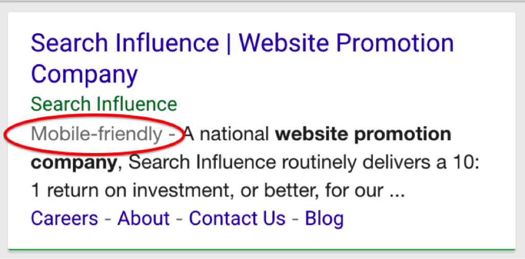

Google’s new mobile-friendly update, which I originally discussed in my Search Engine Land column, is rolling out this month, and it’s time to put the focus on mobile. But with all this buzz about mobile websites, you may be thinking, “My website looks fine on my smartphone when I pinch and zoom, so what’s the big deal?”
Well, there’s much more to it than that.
Step 1: Get a Mobile Website
Just because your Web developer tells you your site is mobile doesn’t necessarily make it true. Make sure you’ve used Google’s handy mobile-friendly testing tool to check your website. In Google’s eyes, businesses have three main options for becoming mobile-friendly: responsive website design, dynamic serving, and separate URLs.
So what option is right for your business? The bottom line is this: for businesses with growing mobile traffic that has not yet reached a critical percent of site traffic, a purely mobile version on a separate URL is a viable option. But for businesses with mobile website traffic pushing 50 percent or more of all site traffic, it is time to invest in a responsive website. While a responsive website typically requires a complete overhaul, your customers will probably thank you when your website can display differently based on the screen size.
Step 2: Use ‘Barnacle SEO’
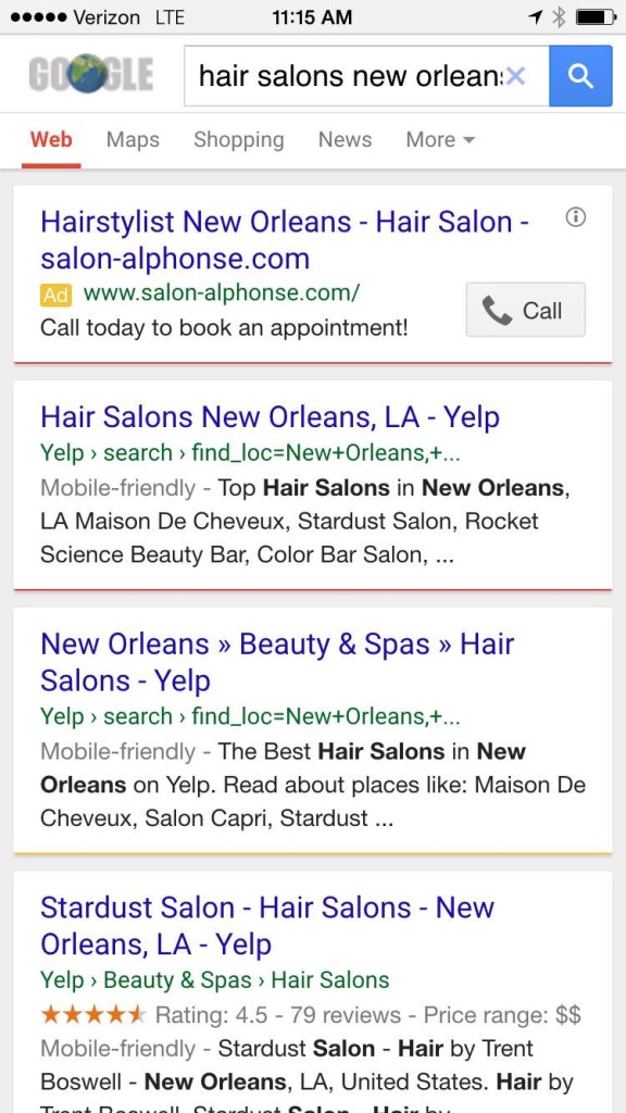
Even before your mobile website is in action, your business needs to attach itself to large, fixed objects, and then wait for mobile customers to float by in the powerful current. I like to call this Barnacle SEO, also known as the “If you can’t beat ‘em, join ‘em” strategy. Basically, this means identifying large, high-ranking online directories such as Yelp, for example, and adding your information there in the hopes of “borrowing” some of their page one rankings. And there are many trusted online directories like Yelp out there you can barnacle up to: Angie’s List, Foursquare, Google+, Avvo (for lawyers), HealthGrades (for doctors), even TripAdvisor.
This strategy works well in mobile because these websites are optimized for the mobile experience—providing the targeted information that local customers searching on their smartphones really need. When you perform a Google search for “hair stylists New Orleans,” for example, the top results are mostly from Yelp:

Step 3: Focus on Location, Location, Location
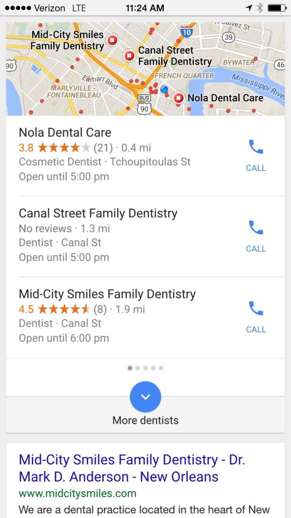
Let’s face it: when mobile matters, location matters. Consider this: 50 percent of consumers who performed a local search on a smartphone visited a store within a day, according to a recent study from Google. So that’s good news for brick-and-mortar businesses with a mobile-friendly website. Those businesses will enjoy the additional ranking factors from the upcoming mobile-friendly algorithm, getting these small businesses in front of their target market at the time and place searchers are looking.
The challenge? Local businesses must break into the top three local results—the ones typically seen on your smartphone. For example, if I search for “dentists,” Google is going to give me dentists near me … and I see only the first three results:

To wrap it up, these are three steps you can get started on now. But remember, as with all Google algorithm updates, stay calm and give it time. April 21 was not the end-all-be-all date. This rollout will likely be a period of rollouts rather than a single-day launch. We usually recommend giving an update 60 days to see the full impact. And even then, there are revisions and updates and you just don’t know.
So what’s your next move? Keep an eye on your website traffic to see if the update is impacting your mobile traffic. If you need help, give us a call at 504-208-3900. We’re here to help ease your “Mopocalypse” fears.

