Rookie Website Mistakes, Part 4: You Have a Single Page Website
September 15th, 2017 by
Single page websites are very popular right now with web designers. With so many new ways to develop websites, they’ve become a unique and scroll-friendly way for users to interact with a company in a way that they’re used to (cue the token image of people scrolling through phones). And, to be fair, they can be quite beautiful. For example, take this design from 415-Agency, a San Francisco-based design firm that works with healthcare companies to make their digital products user-friendly, seamless, and as they put it, “awesomely good looking.”


It’s an understatement to say that ton of work went into this site—it won them an honorable mention award from Awwwards, an organization that gives awards for the best designs, talent, and web dev agencies across the world. I’m a huge fan of exciting visual content, interactive graphics, and designs that enthrall. But, where some entrepreneurs get into trouble is when they try to manage a killer single page website while also optimizing it for SEO. They may come to discover that, for all its glitz and beauty, they’re the only ones actually finding it online.


Form Must Follow Function
Just as the customer is always the top priority, your website should follow that same line of logic. When thinking of how to design your website, think of not just how users will react to the visuals, but also how they will eventually interact with the site’s navigation. Give them clear avenues for finding more information, ordering products, or exploring your blog or testimonials. While a single-pager may seem simpler, it can often be easier to get lost and frustrated with trying to find a relevant page of content. To quote marketing guru Neil Patel, “website usefulness is more important than website beauty.”
If a user comes to your site and thinks, “wow,” then give your web designer a bonus or yourself a pat on the back. But, the more important thing you should worry about is if their next word they is, “how?” Users should know how to interact with your site pretty easily. If they don’t know what to do or how to do it, then your site is harming you, not helping you. This can also lead to high bounce rates—users will eventually get frustrated and leave your site for one with better navigation.
Another thing that can contribute to high bounce rates from your one-page design? Slow load times. I wrote about this in a previous blog in this series, but it’s worth mentioning here as well. Whether you’re using Flash (which, please don’t) or not, data-heavy load times due to unoptimized, large images that occupy your page’s whole screen can strangle your page load times.
Single Page Websites Lack the Opportunity for Detail Laden Content
Single page websites don’t have the space to allow for specific, rich content. From a user perspective, this limits the opportunity to provide a visitor with detailed, relevant content on topics they want to learn more about. Instead, they’re likely only able to view around a paragraph on specific topics. From an SEO perspective, this also gives search engines fewer opportunities to crawl your site for content that can help you move up in rankings while asserting yourself as an authority on your subject. It puts a great amount of pressure on a small amount of words. And, if you do manage to get a lot of content onto a single page, it ends up looking like it’s fighting for space.


Google likes to see that you’re updating your site with relevant content. If you have a single page site, you could make the argument that new content could be added to the bottom, creating an endless scroll of text and images. But, that method still doesn’t address the problem of not allowing search engines to crawl multiple pages of relevant content, and it also creates a headache of a user experience for visitors.
By building out pages for your content to live, you give visitors designated, clean spaces with which they can explore your services, products, or ideas (blog posts) to their heart’s content. They don’t have to scroll for a minute or two to find your latest blog post, and search crawlers can find it easier, too.
Forget About Performing Wide Keyword Targeting
Since single page sites are generally designed around one main concept, the opportunity for using multiple keywords is very limited. With a multi-page site, every page has a chance to introduce a new topic or genre that can include different types of keywords that target different users and open up multiple avenues for ranking.
With a single page site, it becomes extremely difficult to rank for varying keywords. For example, say you’re an owner of an HVAC company. You provide installations and repairs for furnaces, A/C systems, ductless A/C, water heaters, as well as air quality testing. By building separate pages for each of those services, you have an opportunity to move them each up in Google’s rankings, all while showing an increase in your authority. Putting all of your content in one page is like putting all of your keyword goals in one basket and hoping Google magically picks them up.
Missed Opportunities for Quality Tracking
Having multiple pages means multiple opportunities to track user behavior. You can track if someone spends 5 seconds or 5 minutes on a page about one of your services. With that valuable data, you can then focus your goals on what pages need work to bring in more visitors and convert them into customers. Obviously, this would be a difficult task for a single page site. The data showing time spent by your users will be very general, leaving you unable to tell what they love and what they dislike.
Are There Examples of Single Page Designs That Work?
There should and will always be design diversity on the internet. And sometimes, a single page site may work for you. For instance, take this site made by firm Gin Lane for GE that explores everything about the inside of volcanoes. Not only is the site visually satisfying, filled with video and interactive graphics, but the scroll feature of a single page makes sense because you’re literally venturing down into a volcano. Educational sites like this can have the luxury of not worrying about how SEO-friendly their content is because their main goal is to inform, not sell a product or service. Also, it doesn’t hurt that GE has the budget to build a site like this.


Another example of a single page site working to your advantage can be when you’re utilizing it as a promotion. FBC Creative Tech Design created a site for FOX’s upcoming show, “The Gifted,” a show based on the X-men series of comics. The site, using the fictional “Sentinel Services” organization from the show, details the reasons why people should get tested for the “x-gene.” There have been numerous pre-launch sites built to create a buzz around upcoming movies or shows, and this is a fantastic way to build awareness. They’re almost like temporary landing pages. It’s worth noting again that it’s no coincidence that some of the better single-pagers are tied to large organizations—they simply have the budget to pull it off.
Combining the Storytelling Approach of Single-Pagers Into Traditional Navigation Sites
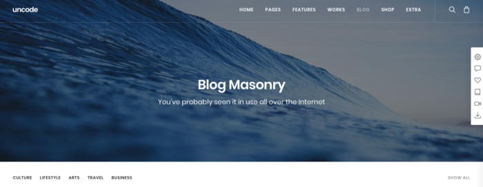
There’s no denying that some single page websites create curiosity. They can encourage the user to explore by simply scrolling instead of clicking, and they (ideally) tell a story about their company along the way. Businesses looking to wow users with a cool site while also being optimized for SEO should try to incorporate this same type of organic curiosity into a multiple-page, traditional navigation website. It’s completely possible. Take this blueprint of a popular WordPress design scheme from Undsgn—Uncode.


Make each page a rewarding experience for users, where they can sit and really get comfortable with your content. If you design your multi-page site with the same goal of clean content without a lot of clutter and clear calls to action, then you’ll achieve a lot of the same aesthetic ideals of a single-pager, and with better SEO capabilities! Also, consider using visual content on your pages, like animation headers and background video. Just make sure they’re optimized so that they don’t slow down your load times.
The ultimate decision on whether or not you choose a single page website for your business will be up to you. Every website is different; it may work for you. But, it will also be that much trickier to see your site move up in Google’s eyes and, inevitably, in rankings. If you decide that more than one page fits your business, you should learn more about SEO services which are imperative to the health of your website.
Stay tuned for our next blog in the series, Rookie Website Mistakes, Part 5: The Content Is Weak.
Images:

