5 Ways to Avoid a Cringe-Worthy Website
August 7th, 2013 by
Although we’ve come along way since the ubiquitous animations and word art of the 1990s (think the official Space Jam ), bad website design still exists. It may not be as obvious to the untrained eye—or as gaudy—as it was with those classic ‘90s sites, but sites that aren’t user-friendly still annoy everyone.
We all have our pet peeves—I, for example, hold a grudge if I have to look any farther than the bottom of the page for a business’ phone number—but some are more widely accepted than others. I talked to the Search Influence Graphic Design Department about the things that drive them nuts, so if you’re looking to tweak your website, these problem areas might be the perfect place to start.
Bad Formatting
For SI Graphic Designer Michelle Neuhoff, this means a lack of structure: “Even if your site does not follow the typical structure, it should still fit within some sort of grid and have a good sense of direction. Readers like to know what they’re supposed to look at next.” For Graphic Designer Will Monson, it means triple columns and justified text. I think everyone can agree that usability is the real goal here. More than anything else, your website should help your user move through the content quickly and without any hang-ups.


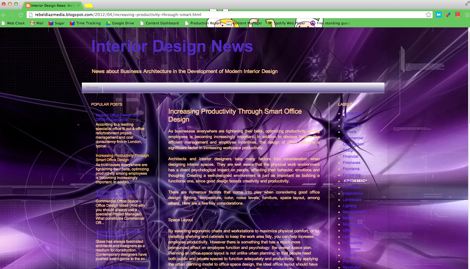
Image via rebeldiazmedia.blogspot.com
Legibility Issues
Your user should never have to struggle to read your content. I understand that you may want eye-popping graphics for your website, but looks shouldn’t interfere with functionality. No matter how much you love the look of yellow text on a purple background, I will never be able to read it without having to rest my eyes for ten minutes afterward. Be careful with fonts, too. “Fonts can be fun, but keep it simple when you have a larger amount of text,” Michelle advises. “Save the decorative fonts for your header or for your call to action.”
Distorted Images
Nothing looks sloppier than incorrectly sized images. When I worked for a magazine, so many advertisers would stretch an image to the size they wanted it, completely ignoring how bad it looked. This is an amateur mistake and is definitely noticeable on your site. “And absolutely no iPhone photos,” Will insists. When it comes to photos, quality is important.
Contact info
Although I’m not a designer, this absolutely drives me nuts. At a previous job, a large part of my day was spent calling businesses, and the most annoying thing to me was not being able to find the contact info within a few seconds. In my opinion, at least the phone number should be at the top or bottom of the page—if not all of your contact info. Michelle recommends either including a tab in your navigation bar or having all of your contact information in the header or footer. “If you’re a business, your potential customers need to know where you’re located, what your hours are, and how to contact you,” she said. “Just make your contact information easy to find.”
Obnoxious Design Elements


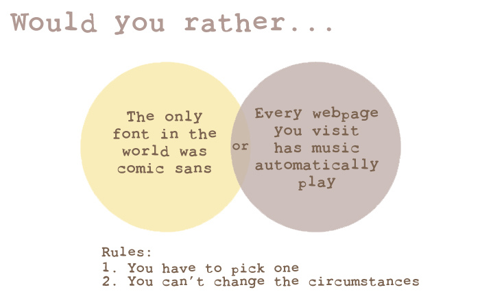
Image via TheCuriousPug.com
First things first, avoid bad fonts. If you don’t know which fonts are bad, learn. “Comic Sans… just don’t use it,” Michelle said. “Papyrus does not mean ‘fancy.’ And remember, sometimes the font you downloaded for free was free for a reason.” Fonts aren’t the only place you can go wrong, however. Will dreads auto-playing music—don’t we all—and flashy transitions on banners. All of these things are annoying a detract from the your website’s content. Whether it’s color, music, or animation, too much is never good. If in doubt, keep things simple.

