Facebook Announces Design Changes and New Features for Pages
March 11th, 2014 by
Yesterday, Facebook For Business announced a new, more “streamlined” design for Pages, which will begin rolling out this week. In addition to the new look, a new feature called “Pages to Watch” will launch, allowing page admins to monitor and compare their page with that of other businesses.
Ch-ch-changes!
Overall, the layout changes to Pages are not terribly drastic, but as with any small change, there will likely come some backlash from the user base. Page administrators have a few new features to look forward to and some adjusting to do when it comes to navigating the platform, as Facebook has rearranged some key features with the design refresh.


Photo credit: http://www.someecards.com
Here are some of the notable changes to the design of Pages and how they might affect you:
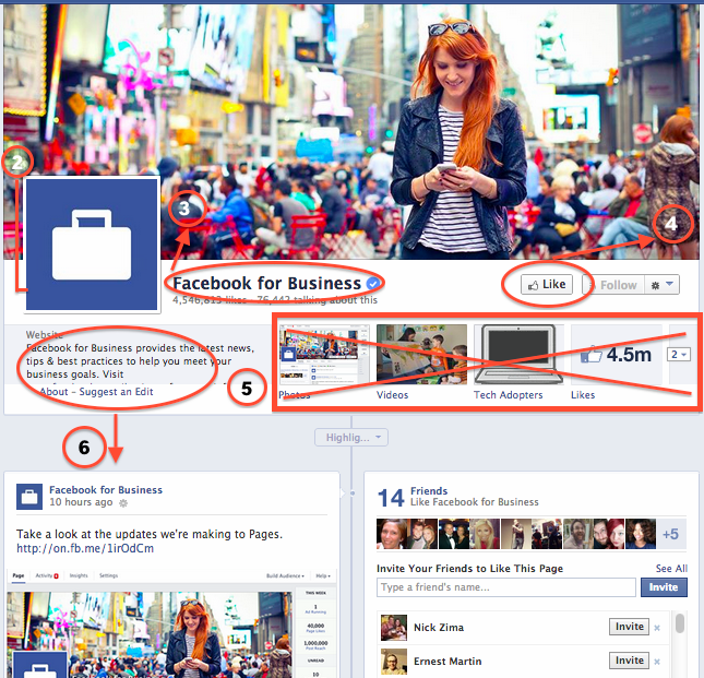
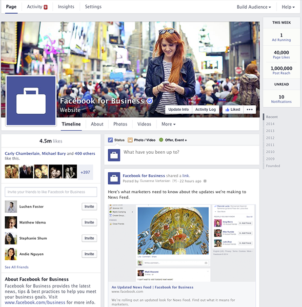
- The cover photo and profile square dimensions do not appear to have changed, though Facebook’s announcement does not specifically list any dimensions.
- The position of the profile square has changed slightly, as the cover photo overlaps farther with the profile square than before. Some design changes may need to be made to pages with a design that integrated the cover photo and profile square together.
- Page name and website will appear in white typeface, overlaid on the cover photo. It appears that cover photos will automatically contain a darker gradient from the bottom up to accommodate this text, similar to what is in place on Twitter header photos.
- The “Like” button has been overlaid with the cover photo (as opposed to the current layout, where the Like button is below the cover photo), which may result in a change to design when the goal is to draw attention to the “Like” button. Some existing Facebook pages with cover photos drawing attention to this button will need to be updated.
- Tabs no longer have square icons appearing below the cover photo. Because the position of these has changed, cover photos drawing attention to specific tabs will need to be updated.
- The “About the Business” section has been relocated farther down the Page Timeline, below the total Likes.
- Other changes directly affect page administrators rather than users. These include:
- Different placement of key metrics such as ads you’re running, page likes, post reach, and notifications from “This Week”
- Direct access to your Ads Manager account from the top of the page when an admin is viewing the Timeline
- Simplified navigation at the top of the page for activity, insights, and settings
The Design As We Know It


What We Can Expect
In addition to the cover photo and general header changes, Pages will now feature a two column layout similar to the old version, but with some notable changes. Now, the right hand column features the Page’s timeline content and posts. Facebook for Business says in it’s post that this “means that all of your posts will appear consistently on your Page and in News Feed.” I’m curious about the latter half of that statement, as it’s currently unclear how the layout change will affect post visibility in the News Feed.


The left column will now display information about your business, starting with the total number of likes. According to Facebook’s release, it will feature a map (though not visible in the images provided), business hours of operation, phone numbers, website URL, etc. This column will also feature photos and videos.
Fancy New Features For Admins
It seems like most of the changes will simply result in a few painful days as Page admins get used to clicking around the new layout, and finding what they need to manage their pages. A few things that will make our lives a bit easier are the relocation of Page insights and admin navigation to the top of the page. There’s now also a more prominent “Build Audience” button, allowing admins instant access to their Facebook Ads Manager account from the timeline.
At the top right, Facebook has also added a “This Week” panel, showing you metrics about your page from the last week including the number of ads running, total page likes, post reach, unread messages, and notifications.
Lastly, the newest and potentially most usable feature is the addition of “Pages to Watch.” This addition will enable Page administrators to keep up with the competition by monitoring Pages of businesses they care about. Other new features in Insights include the opportunity to view engaging posts from Pages you’re watching within the last week.
Are you looking forward to the changes or dreading the adjustment period? Share your thoughts in the comments below!

