How to Drive Conversions With the Right Contact Form—And What to Avoid
August 23rd, 2018 by
Your business’ shiny new website just launched and everyone assumed a deluge of fresh new leads would follow. To everyone’s dismay, the predicted deluge turns out to be nothing more than just a trickle. What gives exactly? “Build it and they will come” may ring true with your traffic itself but that quote lacks an “and convert” at the end. In years past, traffic was the key metric for a lot of businesses since it was assumed that those users would appreciate the brand awareness. Fast forward to the present day in the “Silicon Age” where users not converting is sure to set your business behind further than the Bronze Age.
One easy way to convert users into customers is through the usage of a handy-dandy online form, but just having a form doesn’t guarantee a conversion rate anywhere near your industry benchmark. I’m here to help bolster those forms from some boxes into lead machines!
Positioning
Back when there were only brick and mortar buildings, there was always a huge focus on location, location, location. That phrase may seem like it belongs in the Bronze Age, but it instead adapted to the changing times and is still just as important as it was before. The location of your form is integral to the success of any lead collection campaign. Forms should always be placed in a very obvious place and above the fold, which is the portion of a page that initially loads in the screen’s viewport, as often as possible. Having a form in a good location puts it on users’ minds as soon as they visit your website and makes it more convenient to convert. Overlaying the form over a banner image is a good start for more visibility.
Another excellent location for your form is on the sidebar of your site. This allows casual site perusers to convert at their own leisure instead of forcing them to a contact page or trying to lead them back to whatever landing page they entered the site within. One last location for a form is on your contact page, of course. Any site user would expect a way to contact your business on the contact page. In addition to an address, phone number, or email, a contact form is a perfect way to capture visitors’ information and nurture leads to eventually becoming loyal customers of your business.
Layout
Now that you’ve figured out where to place your form, the next step is to create a form that users can easily understand, fill out, and convert on. One big helper that was pointed out in a Google AI test is how users’ eyes focus on form fields. Having your labels above the inside of form fields is preferable to labels next to the form fields. This allows users to better scan the information and breeze through forms quicker, which leads to lower rates of dropout and errors in fields. Speaking of fields, try not to overwhelm your users with a bunch of unnecessary fields for information that can be gathered further down the line. If you aren’t shipping something to someone, why would you require a home address? If you’re sending users a brochure via email, why would you require a phone number? Requiring an excess of information makes users go “hmm…” and abandon the website completely. This is not to say that long forms have no place on the internet, rather every bit of information should be relative to the call to action.
Here at Search Influence, we use our own proprietary lead tracking system to create fully customizable and extremely flexible forms that can keep track of your website leads in an easy-to-read reporting system. With our forms, you’ll know where your leads come from the most and learn how to optimize your campaigns to maximize your lead generation.
Call-to-Action
A “Call-to-Action” (CTA) refers to the phrase that is meant to draw users into completing conversions. In the case of forms specifically, this would be the text that is on the submit button. Hubspot compiled a list of 31 Call-to-Action examples taken from many different corners of the internet and from varying industries. The main takeaway here is your CTA needs to be catchy and draw a user in. “Submit,” which may be seen fairly often around the internet, doesn’t quite cut it anymore. The end of a form should establish some sort of value to a user. Saying “Submit” simply tells the user that you’ll gladly collect their information and may or may not do anything with it.


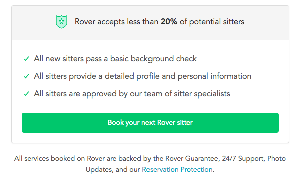
Having detailed text on the CTA button encourages users that your form is something worthwhile whether they’re about to “Subscribe to our newsletter” or Rover.com‘s “Book your next Rover sitter.” Users want to know the value of giving up their precious personal data, so make sure your form is honest and straightforward with how the users’ data will be used.
Mobile
One factor that can’t be ignored is the impact of mobile users on your website. Considering mobile users surpassed the amount of desktop traffic almost two years ago—eons in internet time—ignoring mobile users is a recipe for failure. What’s even more surprising is that in the same year, even though there were more mobile visits to websites worldwide, mobile users converted almost 65% less than desktop users according to the 2016 Adobe Mobile Retail Report.


Our advantage here is that this data is like, eons old. We’ve progressed since then and have become more accustomed to serving mobile users and Google even recognizes the efforts that developers put in to make their websites mobile friendly and adjusted their search to index mobile sites first. This coupled with the rising magnitude of mobile traffic means that being able to capture leads efficiently on mobile platforms is imperative for any campaign.
At Search Influence, we have everything you need to start a lead generating campaign, from SEO services, digital advertising, social media management, and the capability to track your campaign with pinpoint accuracy. We also practice what we preach; check out the form in the sidebar if you don’t believe us.


Thank you for sharing the information…
Yeah, contact form is very useful to increase the conversion rate because if we include a contact form we can Retarget the audience through email marketing, remarketing and other such techniques. So, contact form is must in a website.
You can include contact form in Pop-Up form also in your homepage.