Pick up the Phone: Google is Calling With A Mobile-Friendly Update
March 4th, 2015 by
With Google’s recent announcement that mobile-friendliness will be a ranking signal, we have been fielding impressive numbers of emails and phone calls from website owners asking how this affects them.
Google has been moving toward rewarding websites that are addressing consumer demand with mobile-friendliness. In the official announcement published on February 26, Google says, “Starting April 21, we will be expanding our use of mobile-friendliness as a ranking signal.”
Two factors to consider regarding this algorithm launch:
- This rollout will affect mobile search rankings only.
- This rollout will likely be a period of rollouts rather than a single-day launch.
Mobile Search Rankings Only
In a hangout the day after the announcement, John Mueller, Web Trends Analyst for Google, mentions at about 9:42, “These ranking changes are effective on smartphones for smartphone users.”
Again at 44:40, he reiterates that this algorithm is specific to mobile search. Mobile SERPs and desktop SERPs may become significantly different starting in late April.
(Thanks, Joshua Berg, for the G+ post with topics time stamped).
Why is Google launching a mobile-specific algorithm?
Because mobile use is growing so quickly and is approaching 50% of Internet use, Google wants mobile users to experience relevant, high-quality websites that are designed for mobile use specifically. It’s a recurring theme that Google wants to provide for the user by offering a quality experience.
Um, is my site mobile-friendly?
In November, Google announced the addition of “mobile-friendly” tags in mobile search results.


At the same time, they also gave us a mobile-friendly testing tool. Take note that this testing tool shows you how the Google bots see your site, which is not necessarily how your site resolves on an actual smartphone.
Passing the test means you qualify for getting the mobile-friendly tag in mobile search.
However, even if you have a mobile-friendly (“mobfr” per Joshua Berg) site, if the Google bots can’t get to all of the page elements, the testing tool image result may not be how your site really looks on a phone.
Not passing the test generally means you don’t have a mobfr site. However, I have seen a few sites that are responsive but don’t pass the test. They look great on my iPhone but don’t look great to the Google crawlers.
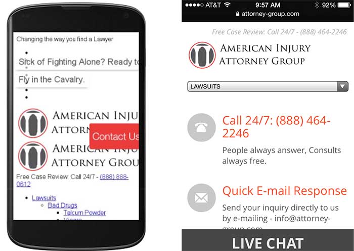
This is an example of a responsive website that looks and functions well on my phone, but the mobfr tool just doesn’t see it that way. (The good news is that this website owner has been working on an improved responsive site that should launch soon, well ahead of the April 21 deadline.)


Do I have to get a mobile site if I want to rank?
In the hangout video, this question is discussed at about minute 12:00. The summary is that mobile-friendly websites will be getting the edge in mobile rankings. Paraphrasing the hangout conversation, non-mobile-friendly sites will not be dropped out of mobile search completely.
Any time you boost the position for a specific set of sites, it will naturally result in the loss of position for another set of sites. Giving precedence to mobfr sites just means not-mobfr sites have to move out of the way.
John Mueller also mentions that if a not-mobfr site renders decently on mobile and is highly relevant, it would be a disservice to the searcher to not serve those sites up in results. It’s all about the searcher.
How much do I really need to worry about mobile traffic?
The number of visitors using a mobile device to access websites has increased dramatically over the last few years. The current average hovers at around 50%, depending on the industry. This is half of a website’s traffic coming from smartphones. I looked at some of our clients to see if I could confirm this stat. I dug around in Analytics and pulled mobile (not tablet) stats for the last six months for two industry types.


For some industries, this algorithm may not be as big of a concern as it is for the criminal defense and plastic surgery industries. I looked at an admittedly small set of clients to get these two percentages:
- Independent insurance agents average 17.48% of traffic as mobile.
- K-12 schools have mobile traffic at an average of 13.87%.
If the mobile traffic to your site is in the double digits but may not be at 50%, you can look at other data points in Analytics. Look at bounce rates, pages visited, and repeat visits from smartphone users to see how satisfied or dissatisfied they were with their visit to your site.
What are the options to make my site mobile-friendly?
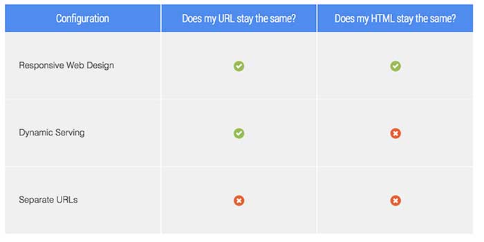
There are three options for developing a mobile-friendly site version. The most common option is to have responsive and mobile serving separate URLs. Here are three options for mobile sites thatGoogle discusses in detail on their developer site:


What’s better, mobile or responsive?
Personally, I love a responsive site because the site has the same HTML, the same URLs, and the same design across all devices: desktop, mobile, tablet.
It should be noted that a responsive design is an investment because it usually requires a complete rebuild of the site. However, if you rely heavily on website traffic for lead generation and if you haven’t redesigned your site in a few years, this may be the time to invest.
A mobile version of your site is a good option as well. You can have either a full version or just a portion of your website in a mobile design. Creating a mobile site with a handful of important pages, or the pages most people visit, may be all you need to deliver to mobile users the information they need.
For websites with an already high percentage of mobile users, I have to recommend responsiveness over mobile. For websites with double-digit mobile traffic, but not 50%, a mobile site may serve you well.
Also, make sure your developer optimizes images and pages for fast page load. Google has been testing with page load speed tags in SERPs too, and if you’re investing in a site upgrade, you should address as many factors as you can at one time.
What about duplicate content?
If you have a mobile site and a desktop site with the same content on two different URLs, these can be seen as duplicate content, which can dilute your content’s authority. Example:
Domain.com/about-us
m.domain.com/about-us
John Mueller commented on this topic: “You don’t have to worry about duplicate content—definitely not when it comes to mobile versions when they’re annotated appropriately.”
You should make sure to get your developer’s assurance that content will be referenced properly between a mobile site and a desktop site.
Your website is an asset for your business.
One small business owner I talk to frequently is in an industry that does not get a lot of leads online. The owner is not interested in anything online, but he knows his customers use his website frequently as a resource, and his site is an asset to the business. He gritted his teeth and devoted a lot of his 2014 budget to technology. He converted his website to a responsive design, and while he was at it, he had the developers add encryption, and he was able to have an app created (which can be an expensive investment for a small business, but in his industry it’s almost required). It’s 2015, and he feels some satisfaction (and relief) that he took care of all of these things last year.
The takeaway is that a business’ online properties are assets that need regular maintenance and upgrades to keep up with the ever-changing Google and consumer demand. If your site is not mobile-friendly, you should talk to your SEO manager as a first step in finding out what you need.
For even more information, see:
March 4, 2015 Google’s Gary Illyes Q&A on Upcoming Mobile Ranking Change
March 5, 2015 Google: The Mobile-Friendly Ranking Factor Runs In Real-Time & Is On A Page-By-Page Basis
“…if you have 10 web pages on your web site and 5 of them are mobile-friendly and 5 are not, then only the pages that are mobile-friendly will benefit.”


